Generate Calendar Heatmap Chart
plot_by_day_per_year_calendar_heatmap.RdCreates calendar heatmap chart to show input/output data per day.
Usage
plot_by_day_per_year_calendar_heatmap(
  power_data,
  year_to_plot = 2024,
  display_mode = "dark"
)Examples
# Example using a small sample data frame
power_data <- data.frame(
timestamp = c(
as.POSIXct("2000-01-01 01:00:00", tz = "UTC"),
as.POSIXct("2000-01-02 01:00:00", tz = "UTC"),
as.POSIXct("2000-01-01 02:00:00", tz = "UTC"),
as.POSIXct("2000-01-02 02:00:00", tz = "UTC")
),
INPUT = c(1.0, 2.0, 3.0, 4.0),
OUTPUT = c(4.0, 3.0, 2.0, 1.0)
)
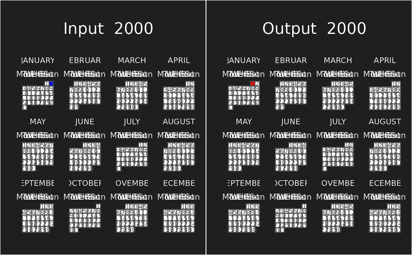
plot_by_day_per_year_calendar_heatmap(power_data, 2000)
#> Warning: OS reports request to set locale to "de_DE.UTF-8" cannot be honored