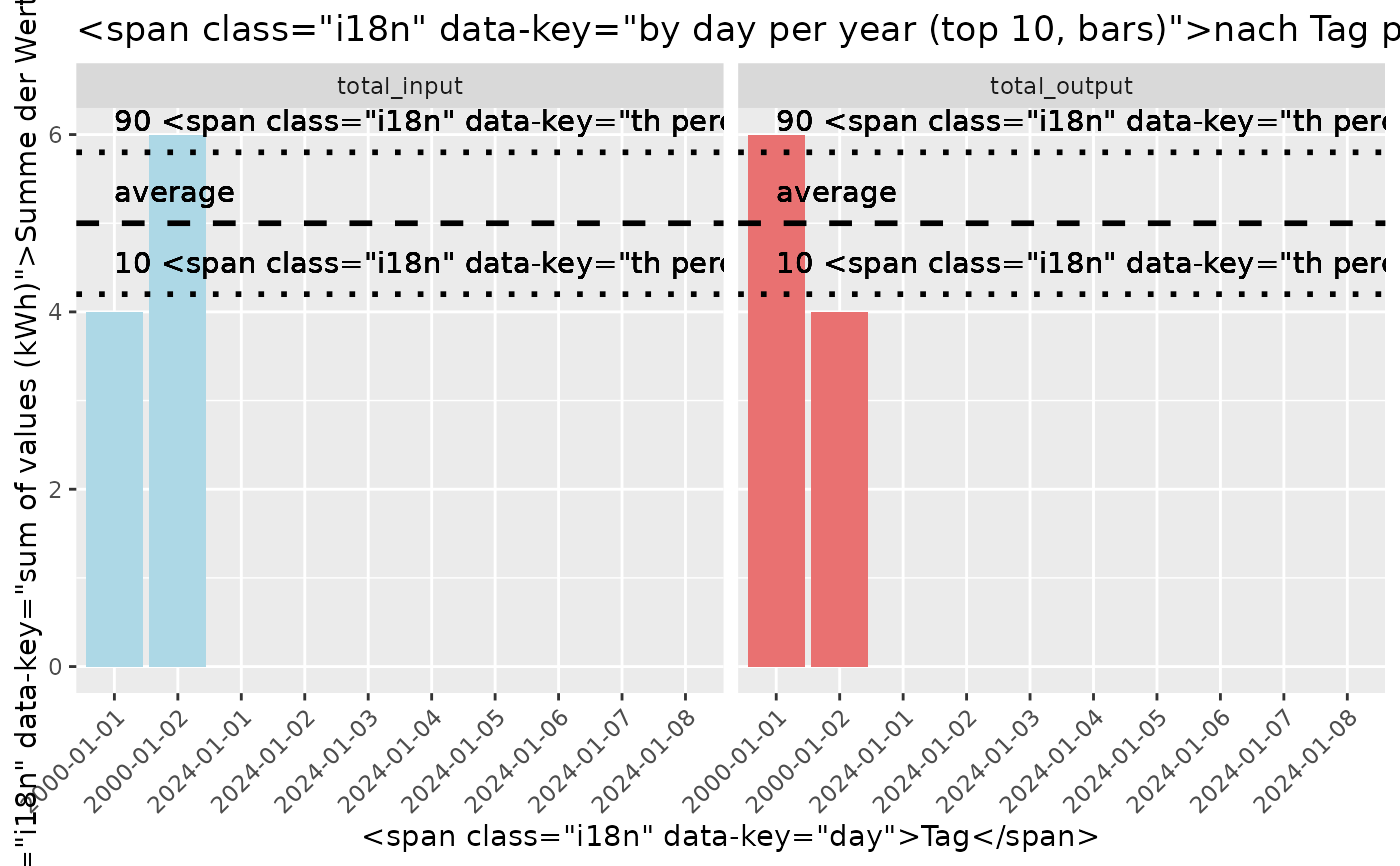
Generate a Bar Chart of top 10 days of power input vs output
plot_by_day_per_year_top_10_bars.RdCreates a Bar Chart and also displays mean and percentile values.
Examples
# Example using a small sample data frame
power_data <- data.frame(
  timestamp = c(
    as.POSIXct("2000-01-01 01:00:00", tz = "UTC"),
    as.POSIXct("2000-01-02 01:00:00", tz = "UTC"),
    as.POSIXct("2000-01-01 02:00:00", tz = "UTC"),
    as.POSIXct("2000-01-02 02:00:00", tz = "UTC")
  ),
  INPUT = c(1.0, 2.0, 3.0, 4.0),
  OUTPUT = c(4.0, 3.0, 2.0, 1.0)
)
plot_by_day_per_year_top_10_bars(power_data)
#> Warning: Removed 16 rows containing missing values or values outside the scale range
#> (`geom_col()`).